Conca Vodka — Disrupting the world of vodka in the form of a Panamerican spirit with a very specific target audience.

Brief

Concept

Result

Involved —

Brand positioning
Identity
Packaging
Product profiling
Digital
Event

The Absolut Vodka Company approached us to design both the strategic and visual identity for a new vodka brand aimed towards Latino new millennials living in LA.

We had the fortunate pleasure to travel to LA to hold workshops to gain valuable insights into the target audience. After a week of intense but very enjoyable research and development it was apparent that the brand should be built around energy, life, colour and most importantly character.

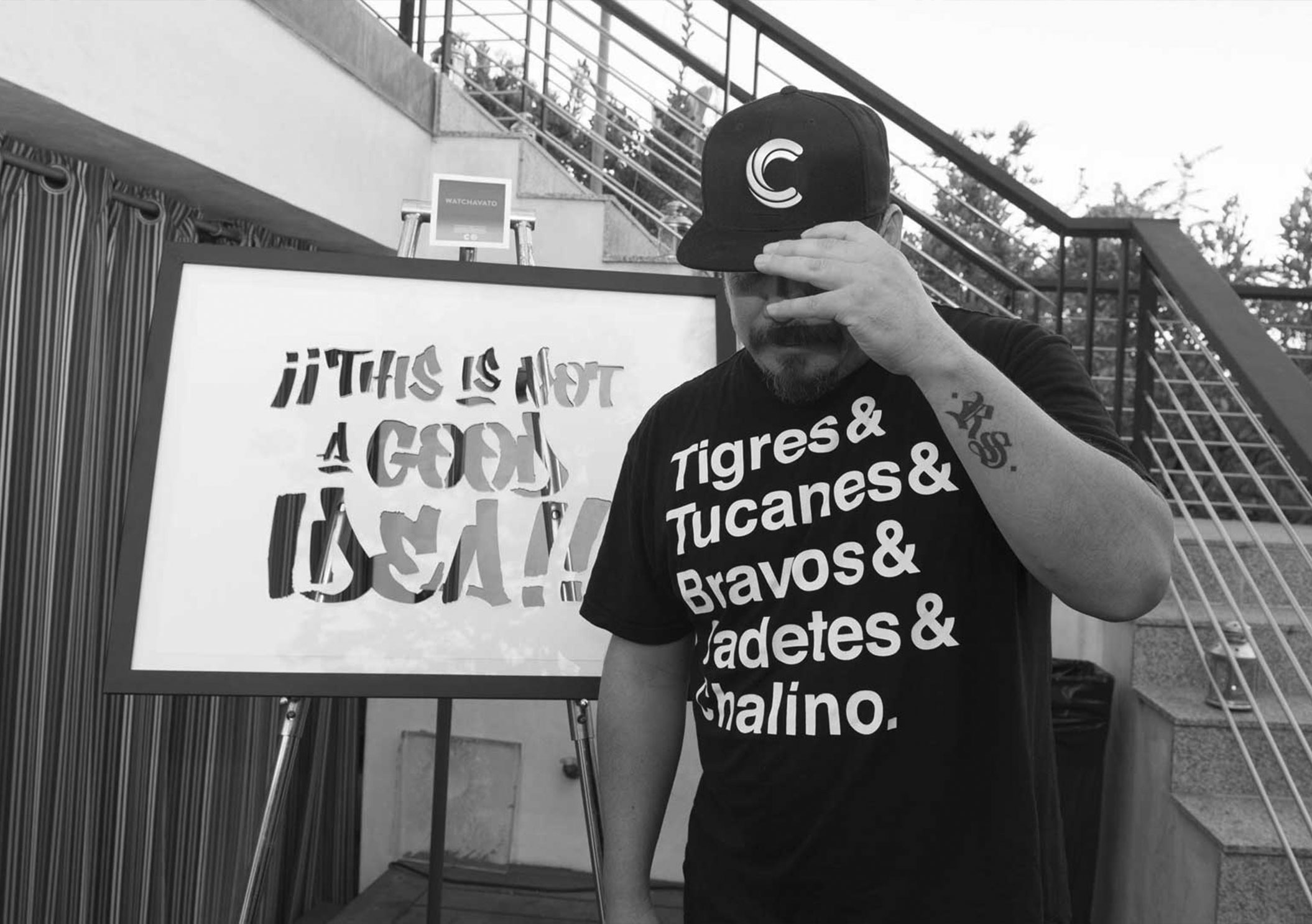
The name Conca is a play on the Spanish words of ‘with’ (Con) and ‘character’ (ca). These words perfectly illustrate the essence of the Latino population in LA, everything they do oozes character.

A huge amount of time and thought went into not just the label design, but also the design of the bottle and even the type of stopper, for which we used a real cork which gave us a great ‘POP!’ when you cracked open a bottle. The start of the party. 

It was about distrupting the market, creating something unique. Vodka purists will tell you that Vodka needs to be in a clear bottle so you can see the purity of the Vodka. To our target audience that wasn’t so important as much as the statement it made.